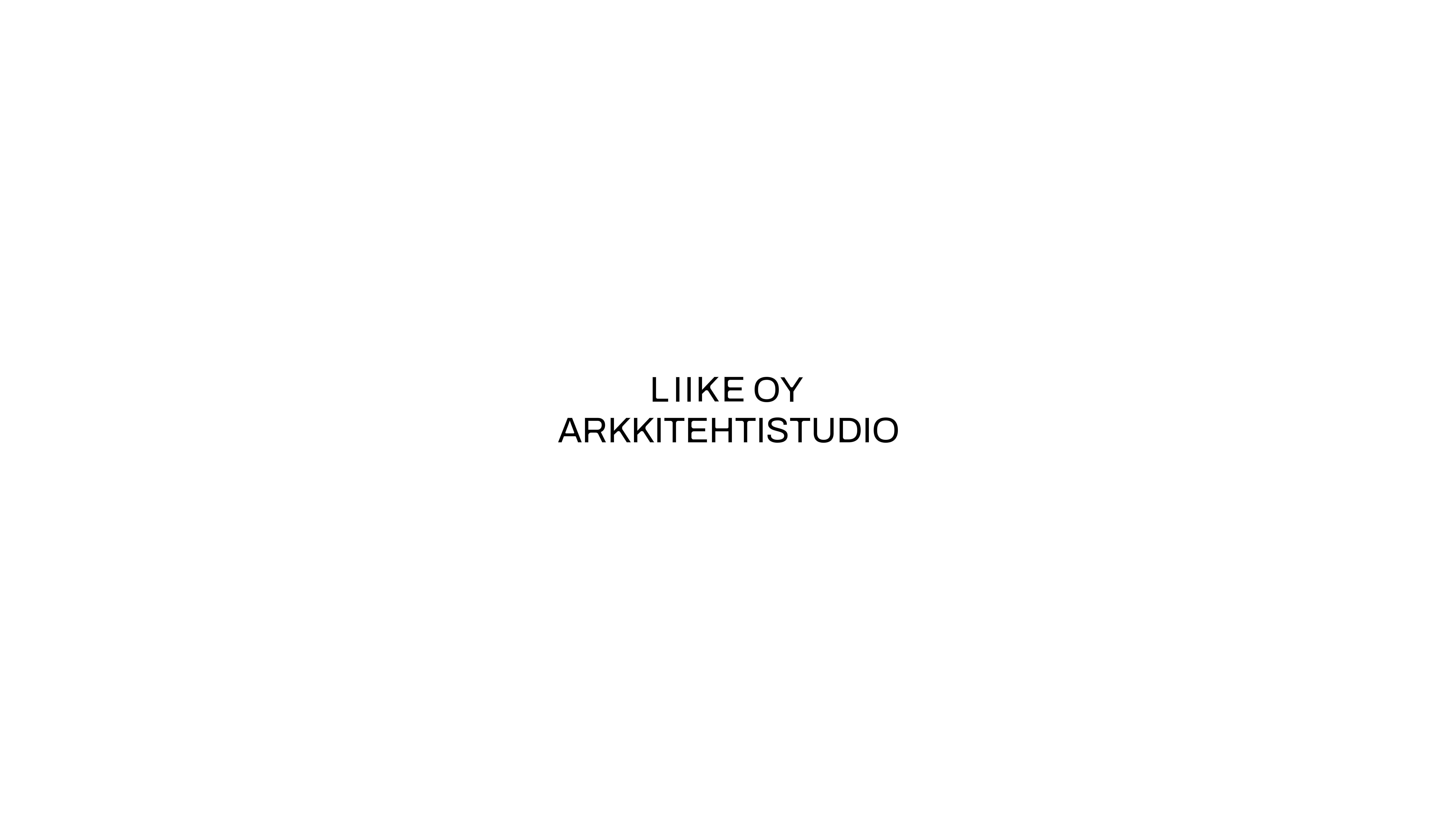
LIIKE
Visual identity re-brand for architecture studio LIIKE.
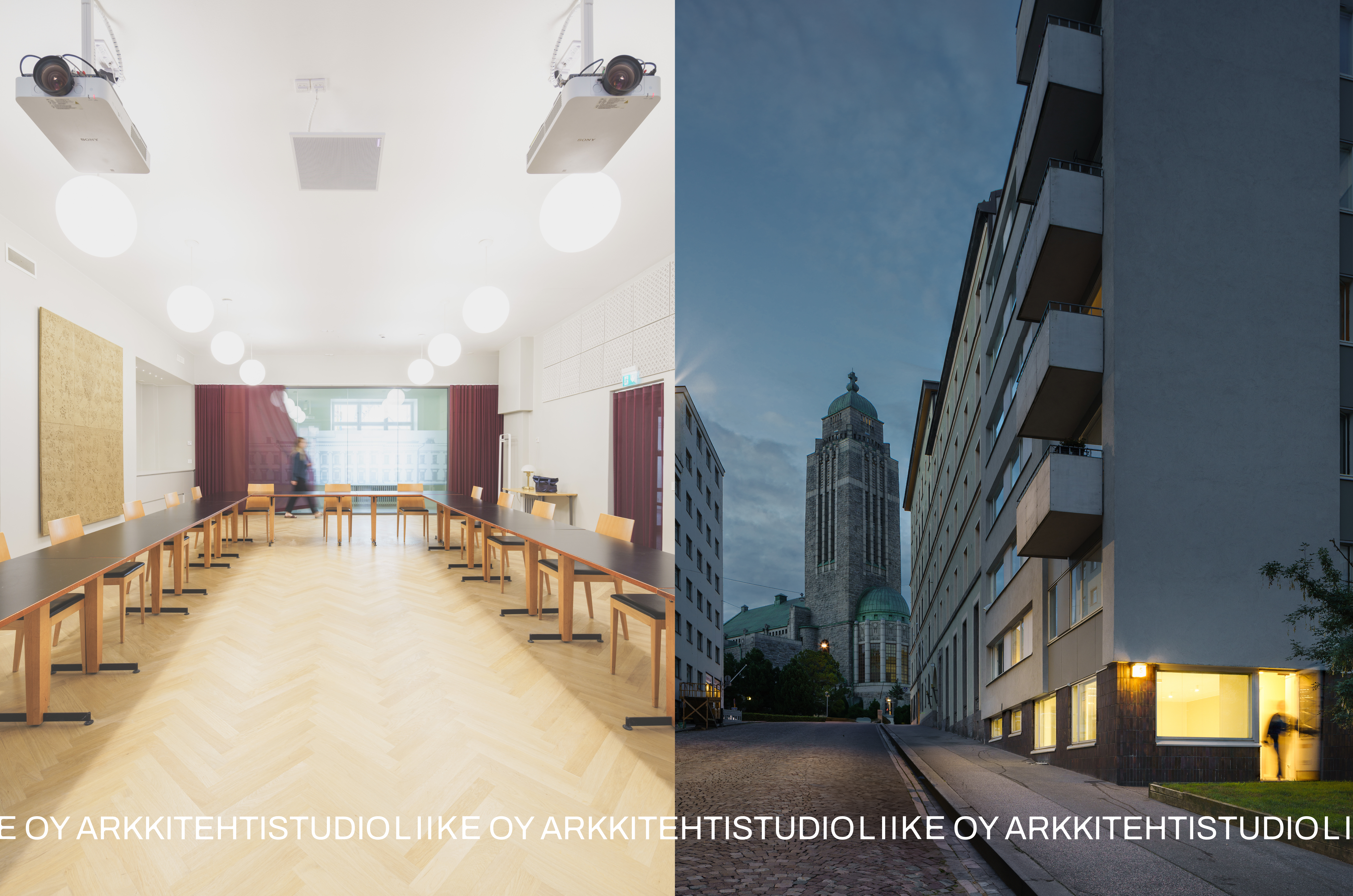
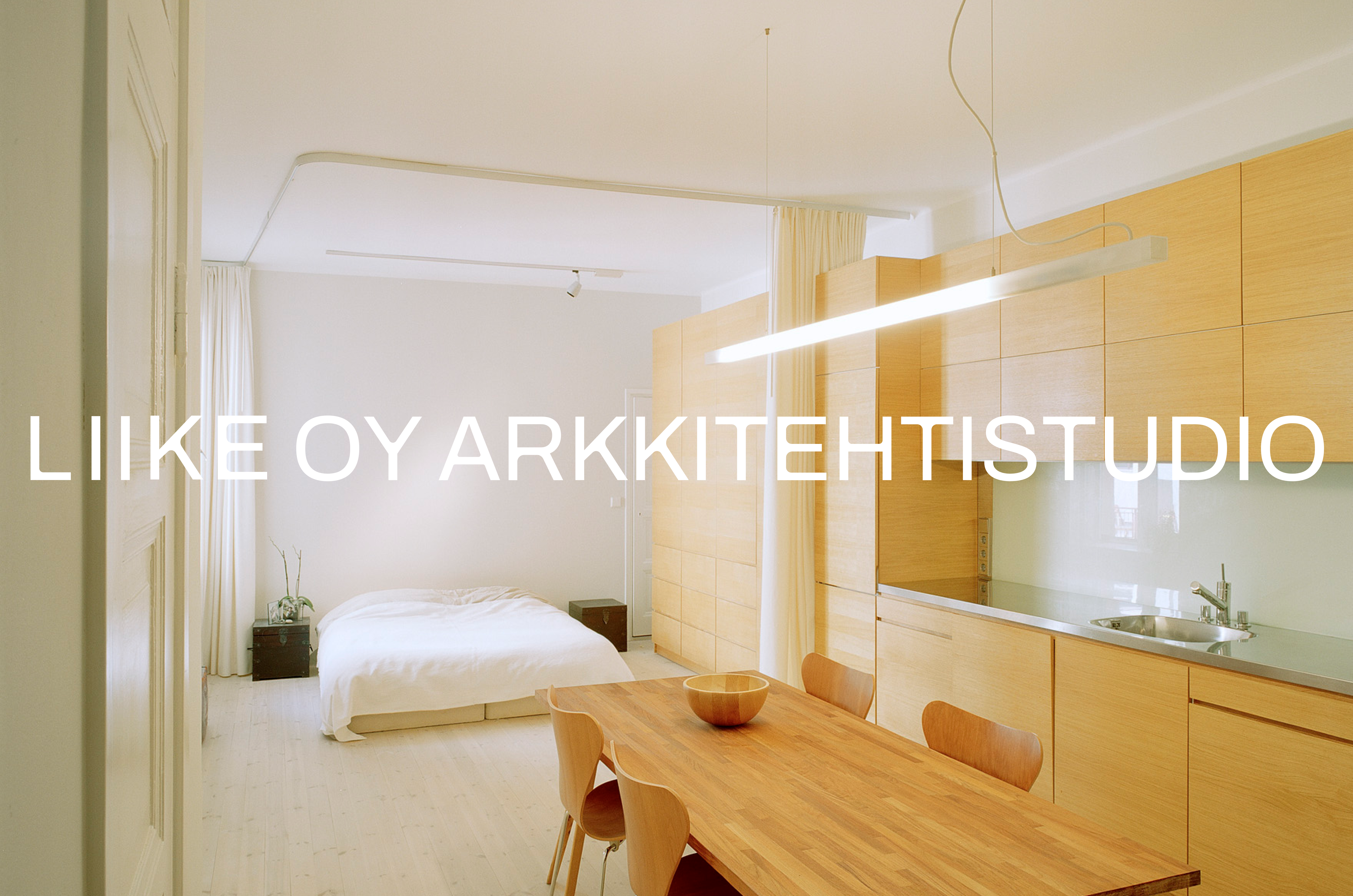
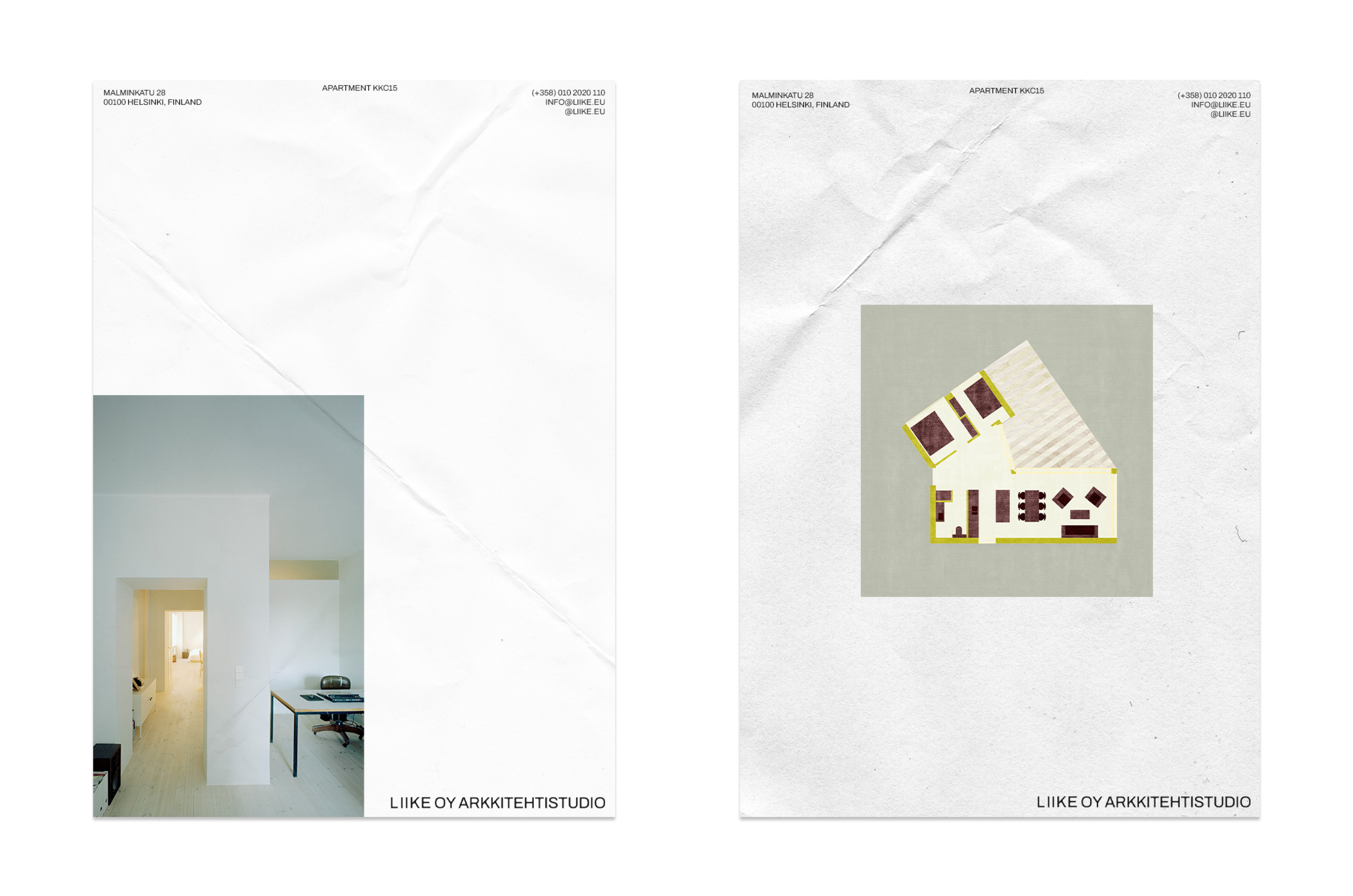
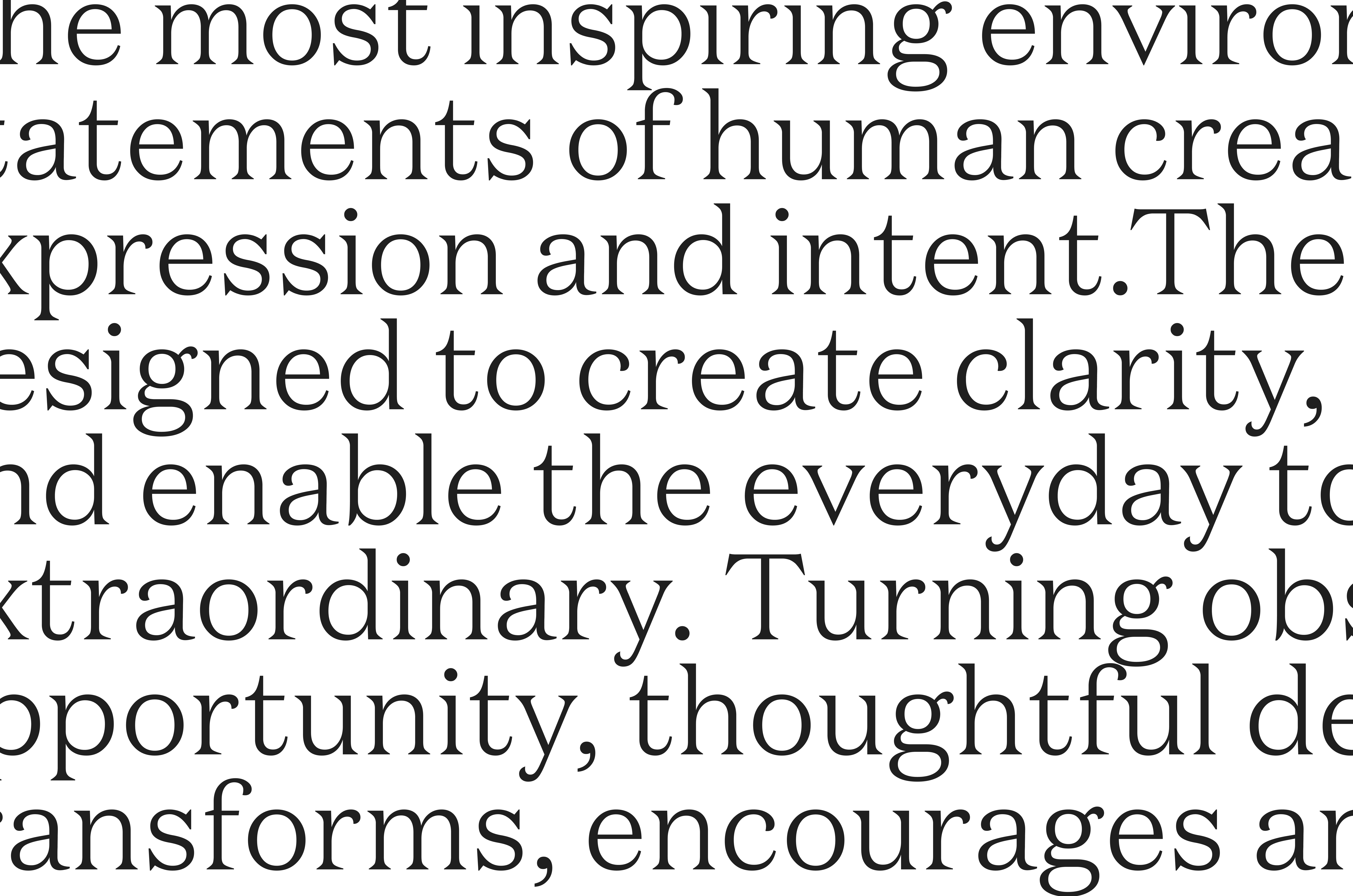
The new identity takes inspiration from the name and ethos of LIIKE. The logo, adapted from the Archivo Regular typeface features curved corners, which symbolize movement. The Finnish word “liike” can be translated to movement.
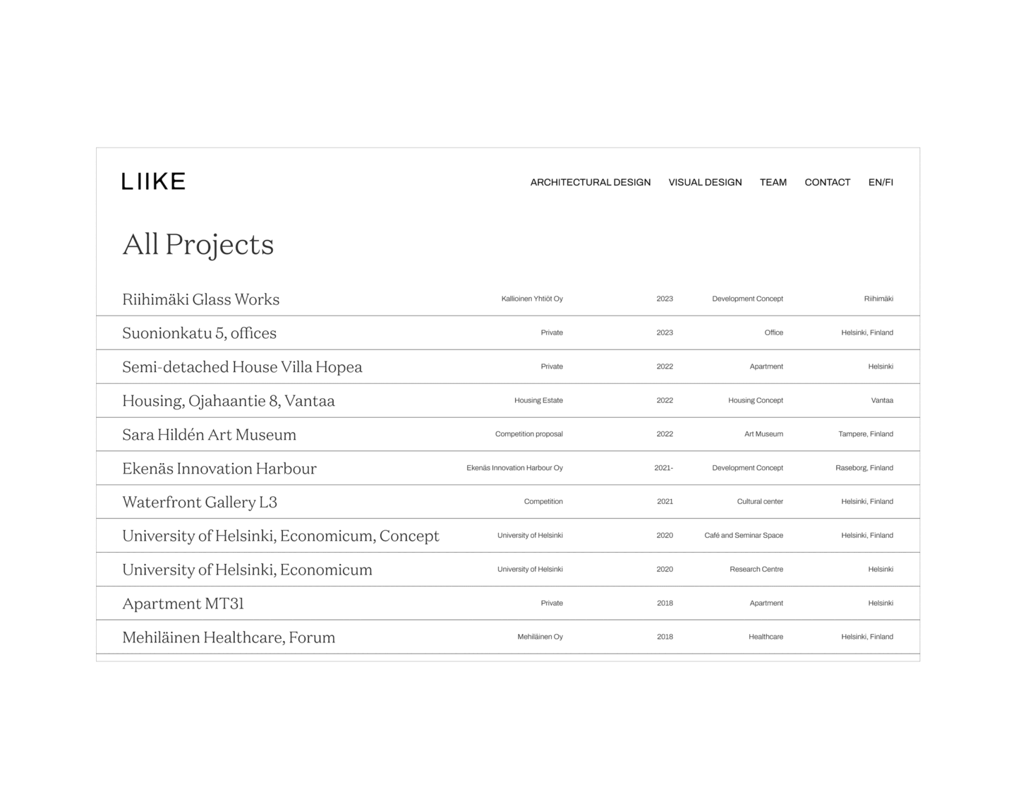
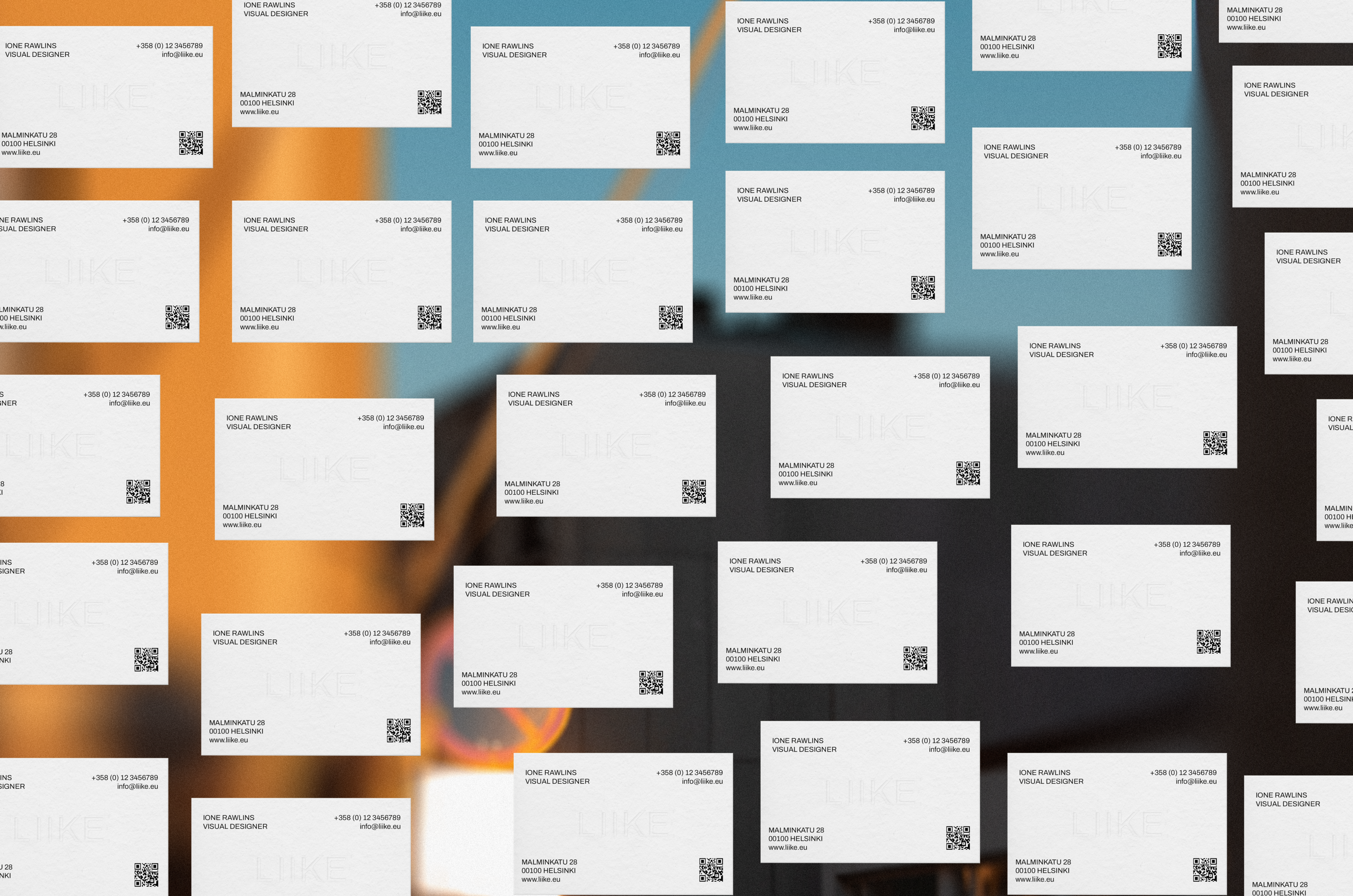
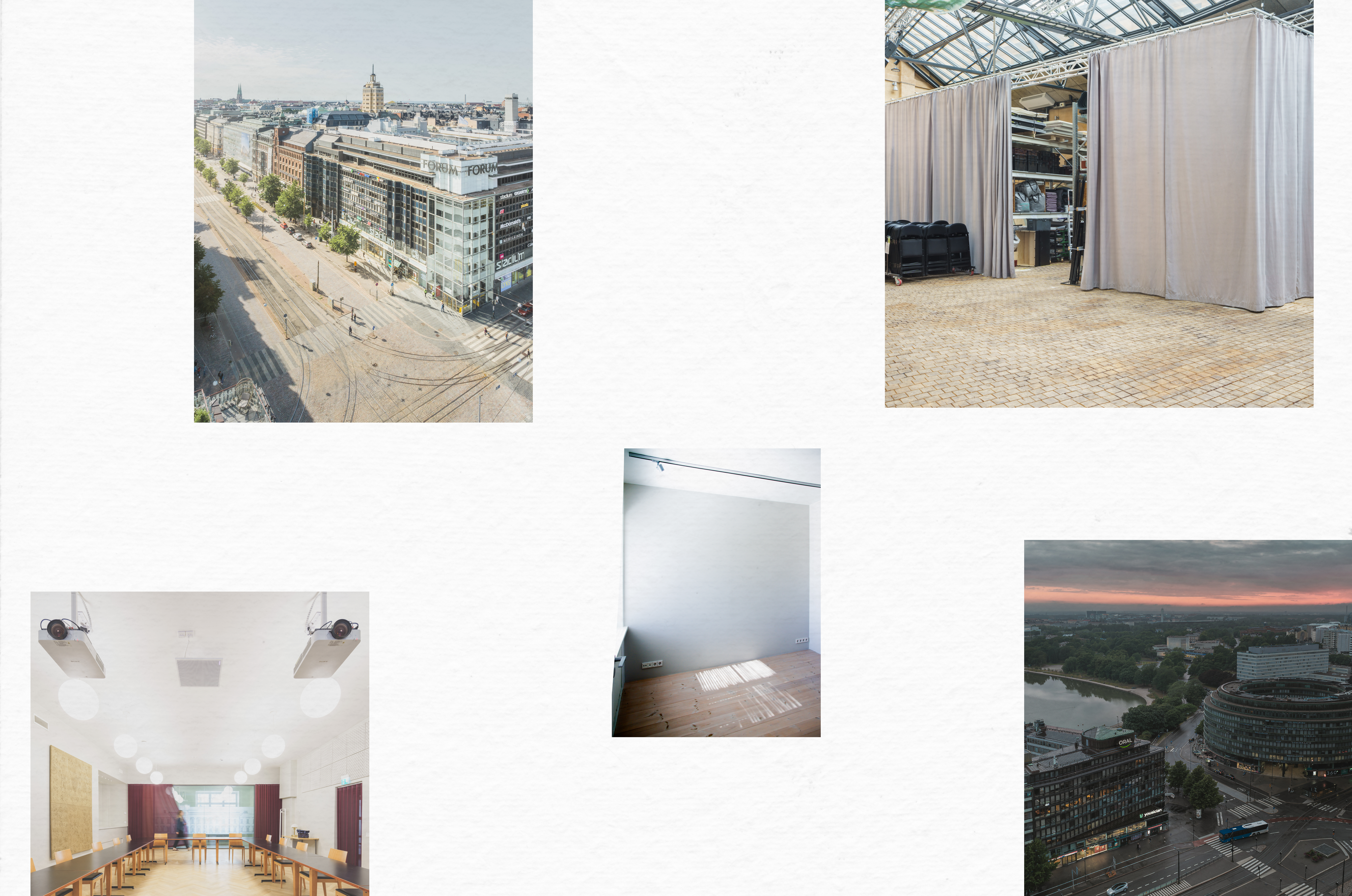
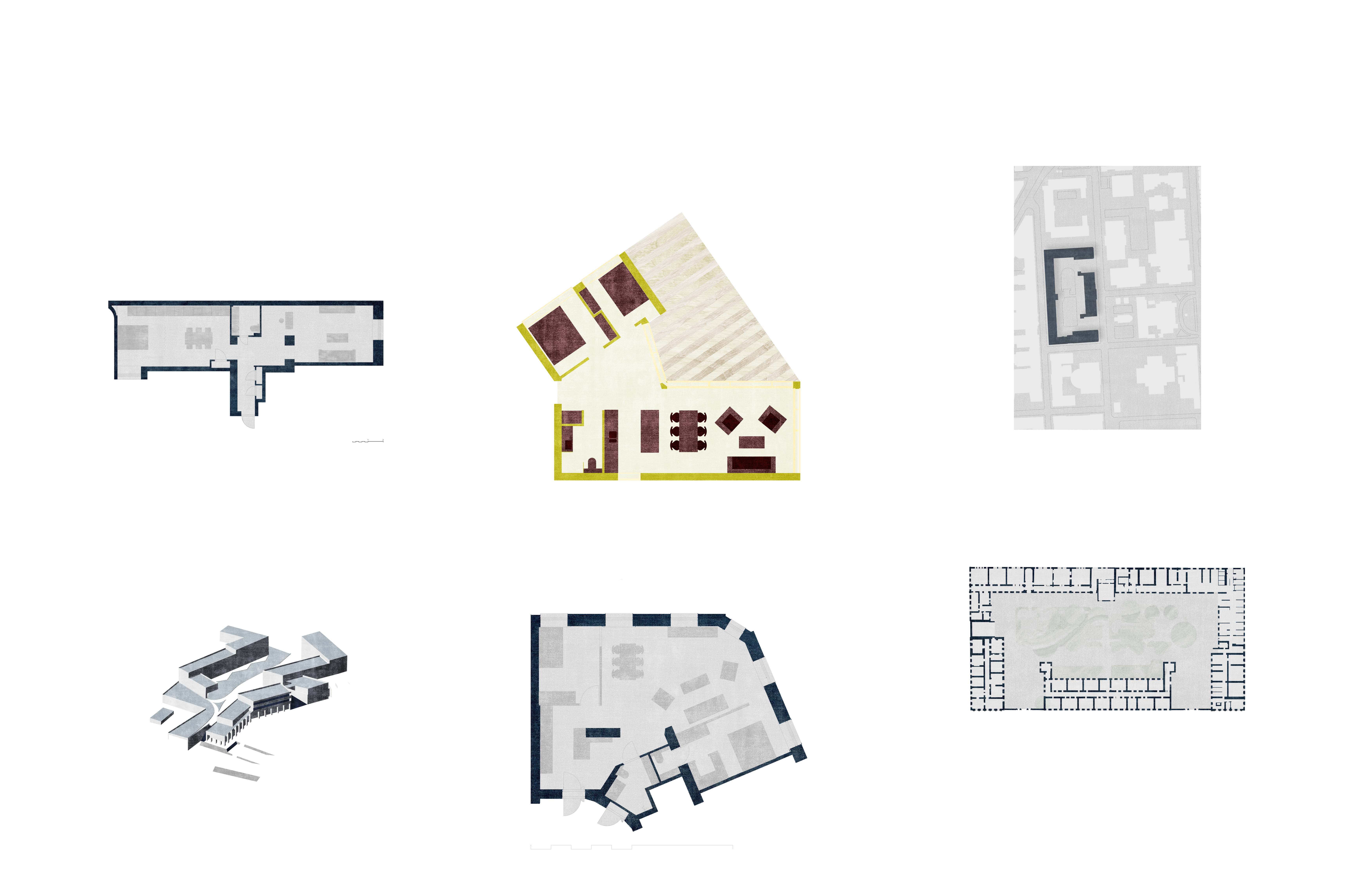
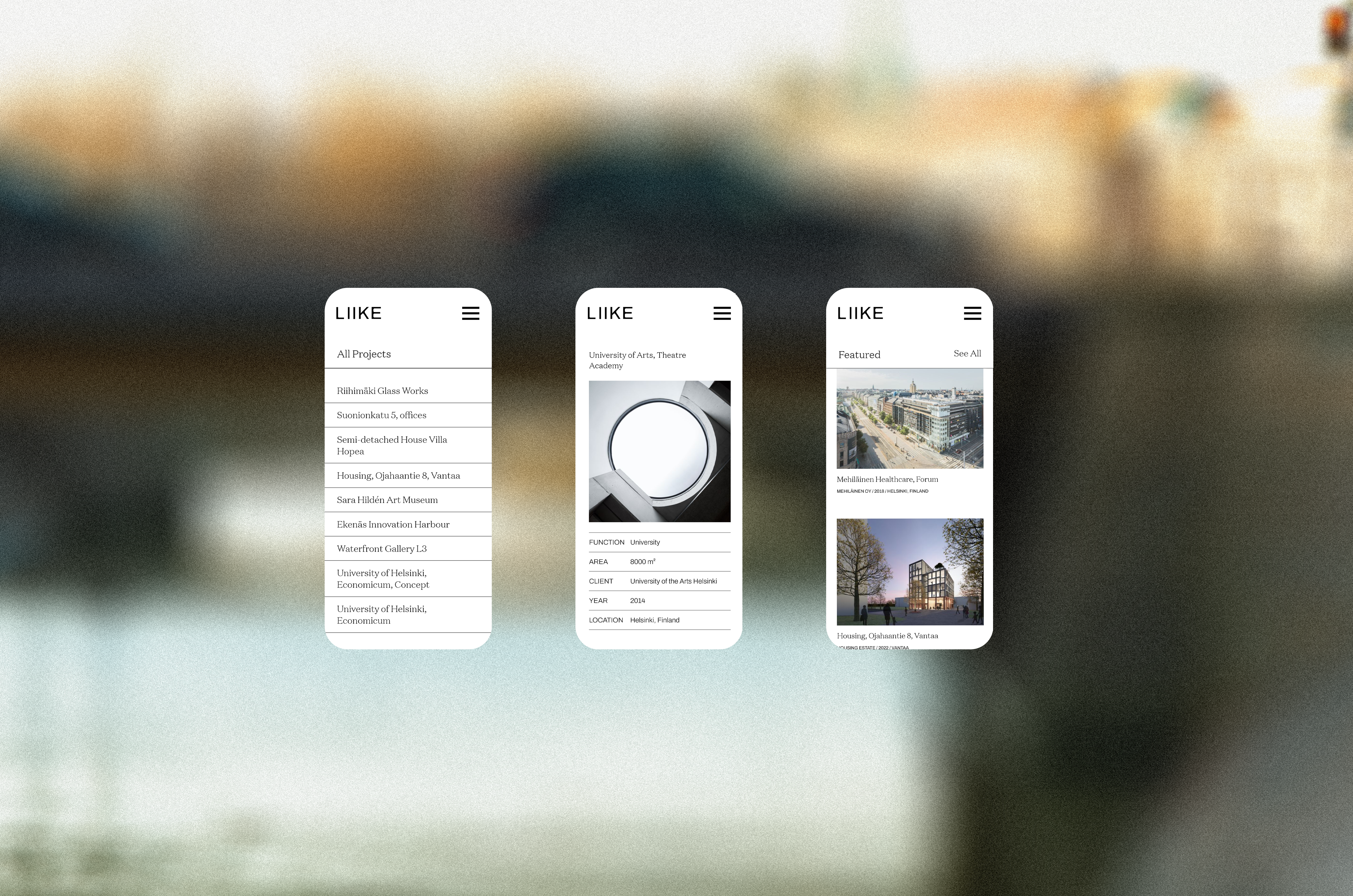
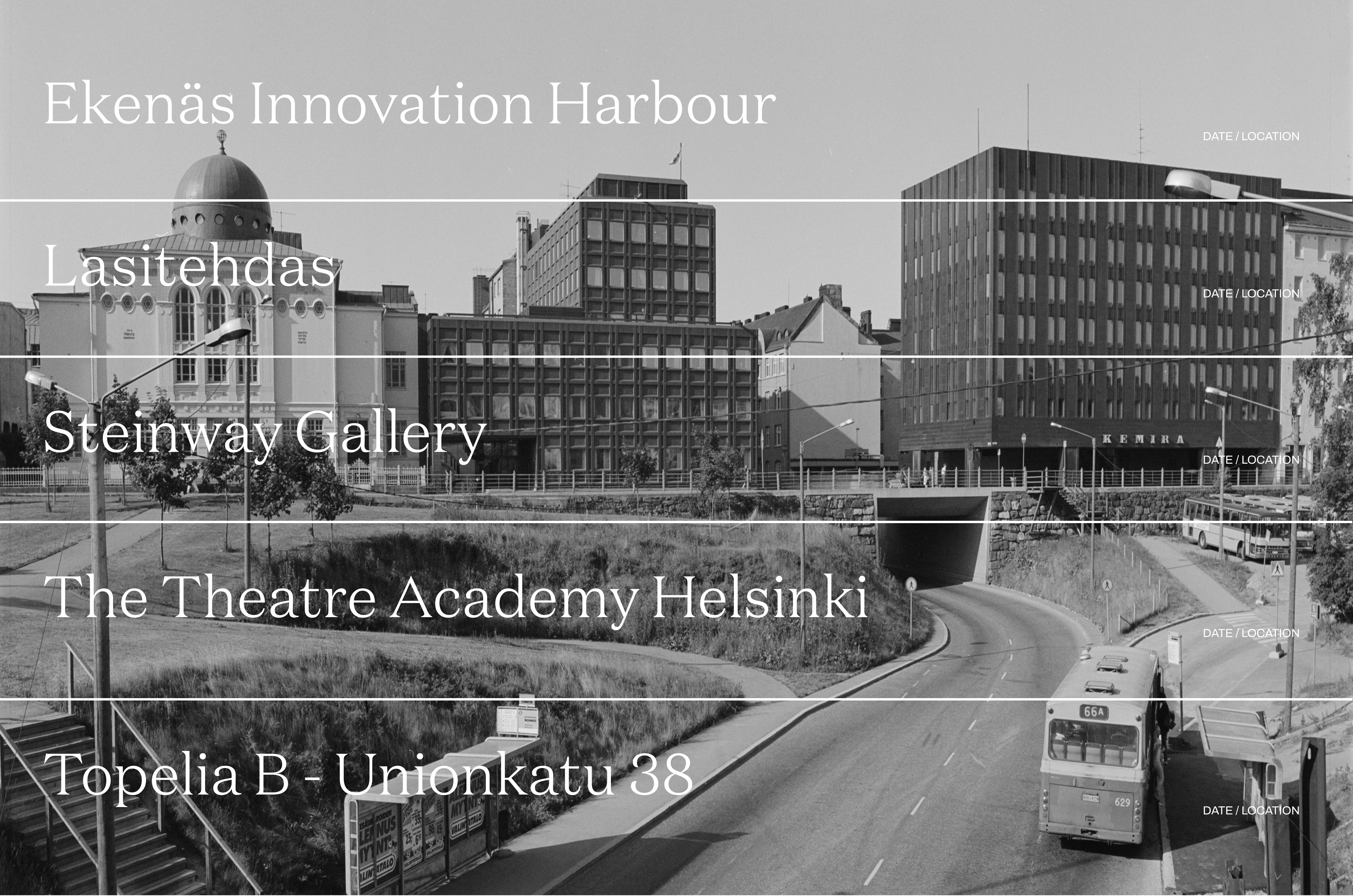
The rest of the identity consists of clean and simple layouts, allowing the design studio’s work to remain in focus.
- Visual Identity:
Ione Rawlins
- Web Development:
Oskar Koli
- Imagery:
Mika Huisman
- Illustrations:
Ione Rawlins